Table of Contents
The Search for the Ideal Blue Imagine this: you’re designing a project—perhaps a website, a logo, or a sales flyer—and you’re sure you need blue. It’s soothing, credible, and universal, right? But there’s a catch: you waste hours adjusting hues, attempting to find the precise blue you’re envisioning. Too pale, and it looks washed out. Too deep, and it’s dominating. You’re stumped and irritated, and time is running out. Familiar scenario?
Choosing the right colours is one of the most difficult aspects of designing. Blue is especially a dynamo colour—it’s used by 33% of the top 100 worldwide brands, notes a 2019 LogoLounge study—but it’s a minefield. There are literally thousands of hues to pick from—how can you get it just right and not go totally insane? Blue colour generators step in to solve the problem. These tools claim to make it easier, save you time, and give your designs a boost. In this article, we’re going to take you through the issue of colour chaos, explore why it’s such a pain, and demonstrate how blue colour generators can be your best-kept secret. Let’s get started.
The Chaos of Choosing Colors
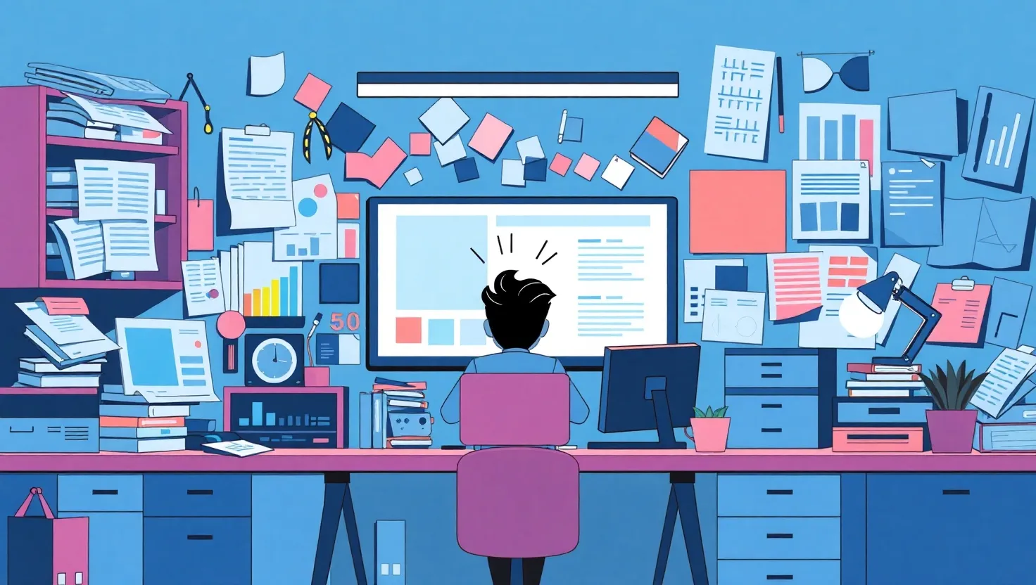
Designers—regardless of whether you’re a seasoned pro or just beginning—understand that selecting colours isn’t as straightforward as it appears. Blue would be an obvious option. It’s ubiquitous: consider Facebook, IBM, or a sunny day sky. But the truth? More than 100 different blues are identified in design programs such as Adobe Photoshop, and that does not include the limitless permutations in between. In a 2021 survey by Creative Bloq, it was discovered that 62% of designers take at least an hour per project struggling with colour selection. That’s the time you might spend perfecting layouts or selling clients.
The stakes are high, as well. Colors determine how individuals view your work. A University of Winnipeg study revealed that 90% of instant judgments about products are based on colour alone. Blue, in particular, has clout—it’s associated with trust, stability, and professionalism. Get it wrong, however, and your design may come across as cold, outdated, or simply off. Ever attempted to use a muted blue for a zesty brand only to find out it’s unexciting? Or choose an in-your-face blue that battles with all other elements? Such blunders are common, and they cost a lot—time and influence-wise.
Then there’s the technical aspect. Designers are working with hex codes, RGB values, and colour wheels, attempting to get shades to match between platforms. A blue that appears sharp on your screen may become muddy in print. Mix in client feedback—”Can you make it bluer?”—and you have a recipe for disaster. Without a system, you’re guessing, adjusting, and hoping. That’s not how you work.
Why This Mess Drives Designers Crazy
Let’s be honest: the blue problem is not a minor irritation—it’s a headache. Suppose you’re building a website for a tech company. You select a blue you believe yells “innovation,” but your client insists it’s too “corporate.” You tweaked it, but now it doesn’t work with the green you selected for the call-to-action button. You’re back to square one, and your deadline’s looming. A 2020 report from Dribbble noted that 48% of designers redo colour schemes at least twice per project. That’s not creative freedom—that’s a grind.
And it’s not just about aesthetics. Bad colour choices tank results. A case study by HubSpot in 2022 tested two landing pages—one with a poorly chosen blue (too pale, low contrast) and one with a balanced shade. The better blue boosted conversions by 21%. Twenty-one per cent! That’s the difference between a campaign that flops and one that pays your bills. Yet, without the right tools, you’re stuck in trial-and-error mode, burning energy on something that should be straightforward.
Even worse, blue’s versatility becomes its curse. It’s got so many personalities—navy for authority, teal for creativity, sky blue for calm. Choose the wrong mood, and your entire design is at a loss. Ever noticed a health brand employing a blue so deep it becomes despondent rather than calming? I have, futzing with sliders in design programs at 2 a.m., asking myself why I did not just keep it in shades of black and white. The inability to control, the lost hours, the second-guessing—it is enough to make any person doubt their abilities.
Blue Color Generators to the Rescue
Here’s the best part: you no longer have to grapple with blue by yourself. Blue colour generators are software specifically designed to dispel the uncertainty and give you the ideal blue, quickly. They’re not random colour grabbers—they’re intelligent systems that scan, propose, and tailor blues according to science and design principles. Let’s dissect what they do, why they are revolutionizers, and how you can utilize them to take your designs to the next level.
What Are Blue Color Generators?
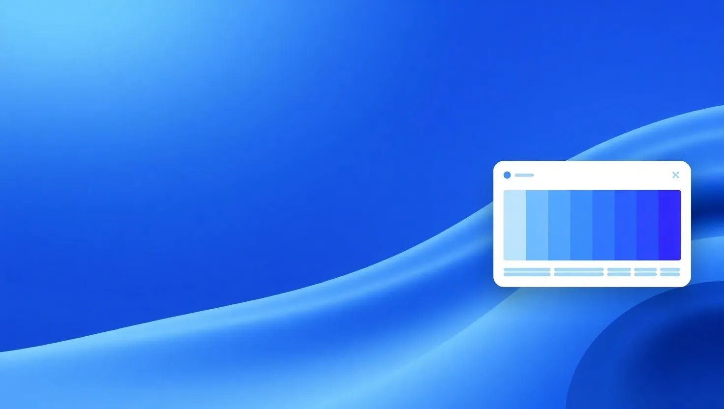
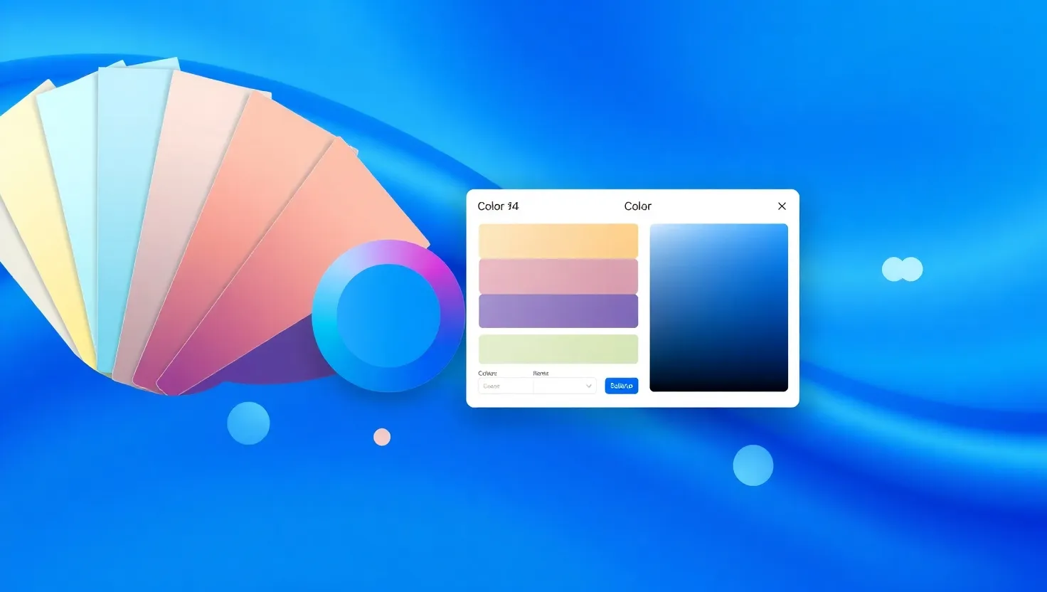
Essentially, blue colour generators are online tools or software functions that generate, customize, and organize blues for you. Some, such as Coolors or Adobe Color, allow you to begin with a starting blue and adjust it. Others, such as Colormind, use algorithms to recommend blues that work well with other colours. You type in a hex code, a mood (e.g., “relaxed” or “aggressive”), or even a picture, and they vomit up choices—along with codes you can insert into your project. No more wondering whether #1E90FF is superior to #4682B4; the tool handles the grunt work.
Why They Work
They save time first. A 2023 usability test by UX Design Institute discovered that designers who employed colour generator tools reduced their colour pick time by 40%. That’s 24 minutes shaved off that hour-long ordeal we described above. Two, they’re data-driven. Most generators are drawing from colour theory—consider complementary colours or contrast ratios—so your blues don’t merely look great, they work. For instance, tools such as Contrast Checker make sure your blue is WCAG accessibility compliant, preventing the “too pale” pitfall from that HubSpot case study.
Third, they inspire. Ever get stuck creatively? Generators tend to recommend colour palettes you wouldn’t have considered otherwise. I once employed Coolors for a charity project and ended up with a pale blue (#87CEEB) and a muted coral. It wasn’t my typical choice, but it worked—clean, friendly, and new. Clients adored it, and it took me 10 minutes to discover.
How to Use Them in Your Workflow
Ready to take a shot? Here’s an easy game plan:
- Begin With Your Objective: Understand what Blue must accomplish. Is it attention-grabbing for a button or calming as a background? For a fintech app project I did, I required “trustworthy yet modern.” I entered that sensation into Colormind, and it returned to me #4169E1—a regal blue with technical flair.
- Choose a Tool: Coolors is wonderful for rapid palettes. Adobe Color goes further with bespoke rules (monochromatic, triadic, etc.). Canva’s generator is easy to use for beginners. Try a few—most are free at the entry-level.
- Experiment and Adjust: Create some blues, then fine-tune. Push the colour or saturation until it sits right. I began a poster a month ago using #00B7EB, but it was too harsh. A quick bump to #009ACD dulled it nicely.
- Test in Context: Drop your blue into your design. Does it pop against white text? Does it play nice with your reds or yellows? Figma and other tools allow real-time previews. I’ve learned the hard way—check it on mobile, too, not just your giant monitor.
- Save and Share: Most generators allow you to export codes or palettes. Have them on hand for consistency across projects.
Real-World Examples
Need evidence? Check out Slack. Their refresh in 2019 relied on a blue-dominated colour scheme (#36C5F0 amongst others) to be approachable but professional. Bet they didn’t just look at it in their heads—tools like those probably influenced it. Or take a 2022 Smashing Magazine case study: a modest e-commerce store overhauled with a blue (#4682B4) chosen by an AI-powered generator for its checkout button. 15% spike in click-through rates. Stats don’t lie—blue, done correctly, works.
Tips to Maximize Impact
- Pair Wisely: Blue adores neutrals (white, grey) but is dazzling with yellow or orange pops. Generators usually recommend these pairs—listen to them.
- Check Accessibility: Utilize a tool with contrast analysis. A blue that is too similar to your background murders readability.
- Stay Consistent: Choose one or two blues and use them consistently. A generator’s palette prevents you from overdoing it.
Conclusion: Take Control of Blue Today
Blue’s a design superstar, but it’s also a beast to tame. Without help, you’re stuck in a loop of trial, error, and late nights. Blue colour generators flip that script. They’re fast, smart, and rooted in what actually works—not guesswork. Whether you’re building a brand, designing an app, or just trying to impress a client, these tools put the perfect blue in your hands without the stress.
So, the next time you’re gazing at a blank canvas, don’t improvise. Crank up a generator, mess around with some shades, and see your designs spring to life. You’ve got the numbers—40% less time, 21% improved conversions—and you’ve got the expertise. Blue’s waiting. What are you going to make with it?